Market Dashboards - Price and Occupancy Trends
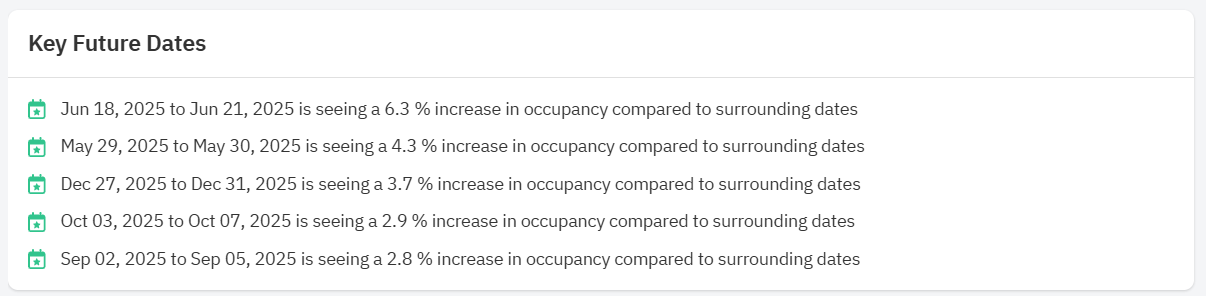
Key Future Dates
Key Future Dates spotlights a few dates that have a higher occupancy percentage compared to the dates surrounding them. You can use the dates shown here to spot emerging high-demand periods and adjust pricing and stay requirements accordingly, and you can check out how each of these dates appear on the Future Occupancy Chart below to compare how bookings are being made on surrounding dates.
Future Occupancy, Bookings and Cancellations
The Future Occupancy, Bookings and Cancellations graph has five lines: Occupancy (in red), Pickup and Cancellations (in grey), Occupancy - last year final (in red dotted lines), and Occupancy - last year today (in grey dot dash lines) made in the selected time frame. The occupancy graph can give you an idea of which dates are still busy and which are low demand dates to think about how you should price your property. The chart will default to showing about the next year's worth of data, but you can use the sliders below the chart or the date range selectors to narrow in on a shorter date range, or select the number of past days for which you'd like to see booking activity.
Future Prices
The Future Prices graph details how property managers are pricing their properties for future dates. Between this and graph above, you can start to think about the revenue management strategy for your properties. The Median Booked Price line is an estimate of the prices at which listings are getting booked. This line is not shown automatically by default since it's an estimate, but you can add the line to view our estimates along with the percentile graphs by ticking the Median Booked Price box above the graph.
Day of the Week Occupancy and Price Factor Charts
Day of the Week Occupancy and Price Factor Charts show you the average occupancy and base prices for each day of the week seen over the past 30 days for listings in your selected area.
Related Articles
Understanding the Market Dashboards
Market Dashboards are fully automated personalized dashboards that can help you track your location’s STR booking data through easy to digest graphs and insights. New user accounts with listings imported in PriceLabs will be credited with 1 free ...Market Dashboards - Key Performance Indicators
This section details eight KPIs for the past 7 days, 30 days, or the last 365 days in the area compared to the previous period of the same length. This section is a great at-a-glance view of market trends for the area your dashboard covers and a good ...'AI Insights' in Neighborhood Data: Understanding Price and Occupancy charts
At PriceLabs, our mission is to democratize revenue management. This is why we’re thrilled to announce that we’re now leveraging Generative AI to turn complex data into simple sentences. We can convert a data-rich graph into a clear text paragraph ...Listing Neighborhood Data
When pricing any listing, there are always several questions that come up: What is the average price in your area? How are prices compared to comps? How does occupancy compare? How are listings priced in the next months? Are they getting booked? Are ...Market Dashboards: Glossary of Terms
Glossary of Terms Active Listing: A listing that is active or was active within the past 15 days on any booking platform like Airbnb or VRBO. Active Dates: This indicates how many days the listing was open to reservations. As an example, some host ...
Sign up for training
To help you get the most out of PriceLabs, we have training webinars in English, Spanish, Portuguese and French. Click here to Register.