Listing Neighborhood Data
When pricing any listing, there are always several questions that come up:
- What is the average price in your area?
- How are prices compared to comps? How does occupancy compare?
- How are listings priced in the next months? Are they getting booked?
- Are there certain dates that are getting booked more than others? Are other listings in your immediate neighborhood increasing prices for peak demand?
The Neighborhood Data feature can be used to investigate the answer to some of these questions. Even though there are a number of other factors that can affect how rates are set, we hope that this hyper-local data will be a convenient place for PriceLabs' users to explore local trends.
To access it, click on the "Neighborhood Data" tab on the Review Prices view from the Pricing Dashboard for one of your listings to view useful information about other listings in your locality. Note that all prices will be in the same currency as your listing.
Starting at the top of the view, you can see a bedroom filter, click and drag to filter out your selected bedroom range -
Data Source
You can choose between 2 different data sources for your neighborhood data analysis.
The two options are:
1. Nearby Listings
- Default
- You can Select any of your active dashboards as the data source
- Then choose a bedroom category or a comp set
- The summary table will render Booked Prices along with Percentile prices if Market dashboard is the data source
- Compare Competitor Calendar will work across data sources, i.e., the options will depend on the data source, but once selected, they will stay till removed. You can compare listings between VRBO and Airbnb.
- If you have no Market Dashboard subscribed to
- You will see a prompt asking to create a Market Dashboard, the 'Create One Now!' link will redirect you to Market Dashboard page.
- If Market Dashboard is selected as a data source, but later the subscription for Market Dashboard ends, we'll automatically default to nearby listings.
- Please see: How to Use Comp Sets for Benchmarking
Important Notes:
Market Dashboard is a separate product, and we will charge extra for these dashboards. More information here.
After creating a compset, make sure to view the compset first on the Market Dashboard so you can access it as a Data Source. Otherwise, it will take overnight to load before you can access the compset from the list of Data Source.
What this enables:
- Customers who create curated comp-sets in MD and want to compare rates against it for a new unique property in ND (frequently, these customers would do this in PA, but until they had a reservation, PA wouldn't work) - this could be properties with pools, professionally managed, etc.
- Customers who want to include listings in CCC (Compare competitor calendar) from a wider area that wasn't close enough in the default will be able to do that with Market Dashboard.
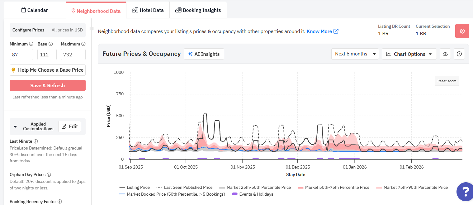
Future Prices & Occupancy
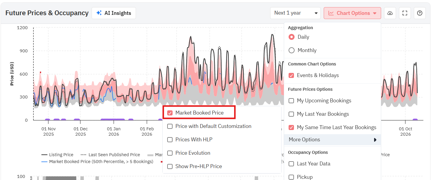
Daily vs. Monthly Aggregation
When analyzing the Future Prices chart in Neighborhood Data (and in Review Prices customization), you now have two ways to view price trends:
- Daily aggregation – shows prices for each individual date, giving a detailed view of nightly fluctuations. This is the standard approach for most short-term rental (STR) strategies.
- Monthly aggregation – groups prices by month, providing a higher-level view of average or total monthly values. This is particularly helpful for mid-term rental (MTR) users or when reviewing longer booking horizons.
- Sum vs. Average toggle (top right of the chart in monthly view for Future Prices). By default we show the Average, but users can switch to Sum
Events and Holidays
- This option allows you to view which dates have events on holidays as these will affect the fluctuation of your prices.
- Only available on the Daily Aggregation option
Full Screen Mode
- This option allows you to view the Future Prices & Occupancy graphs in full screen.
Future Prices Chart
The Future Prices chart shows you your Last Seen Price (dotted line) and Final Prices (solid line), along with the 25th-50th percentile range (Gray), 50th-75th percentile range (Dark Pink), 75th-90th percentile range (Light Pink) of daily rates for the next year.
When you hover over the chart, you will see your actual last seen and final prices for that date with the 25th, 50th, and 75th percentile prices (the low, average, and high for your neighborhood). Be sure to pay attention to each field as you move through the year; your last seen and listing prices will move depending on where they fall compared to competitors' prices.
When looking at the Future Prices Chart, keep in mind that your Last Seen Published Price is the price we saw from your listing on your PMS, channel, or channel manager; this is updated any time a sync or Save & Refresh is done. If this listing has been syncing with PriceLabs for at least a day, this is usually yesterday's rate. The Listing Price is the price currently shown on your PriceLabs calendar. If you're seeing a slight difference between the last seen and final pricing lines and haven't made any changes to your base price or customizations, you are likely seeing the difference between yesterday's and today's rates.
My Upcoming Booking
- When this feature is enabled, you can see which dates you already have bookings as of today.
- This helps you see what dates are already booked and what is the ADR for the upcoming booking.
- You can enable it by checking the “My Upcoming Booking” box under the Chart Options button in the Future Prices chart.
My Last Years Booking
- When this feature is enabled, you can see which dates you had bookings last year.
- This helps you see what dates got booked last year and what is the ADR for the booking.
- You can enable it by checking the “My Last Years Booking” box under the Chart Options button in the Future Prices chart.
My Same Time Last Year Bookings
- When this feature is enabled, you can see which dates you already had bookings by this time last year.
- You can enable it by checking the “My Same Time Last Year Bookings” box under the Chart Options button in the Future Prices chart.
Market Booked Price
This is available inside the "Chart Options" on Future Prices chart. When this option is selected or check marked, it adds a line on the Future Prices chart in dark brown color.
- For every date, it tells the median (50th percentile) price at which the listings in the market got booked at.
- This can give you an idea for the date of your interest ( especially holidays/events etc.) about the median price at which market got booked at, and depending on how far the date is, how you should make adjustment to your revenue management strategy (if needed)
Its only available if the date has at least 5 bookings.
Price Evolution Data Feature:
- We offer the ability to view what prices we suggested 1, 2, 7, 30 days ago for any future date. You can even see the price same time last year (if the data is available).
- Our long-term users will be able to see the prices that were suggested at the same time last year, which can be convenient when looking at the price recommendations we are making for 2025 and to see what we have recommended for 2024.
- You can enable it by checking the “Price Evolution” box under the Chart Options button in the Future Prices chart under the Neighborhood Data tab
How does the 'Price Evolution' option help?
- This feature helps users understand the evolution of our pricing recommendations.
- With this, users can track the prices we recommended in the past, offering a clear view of how our price suggestions have changed over time.
- This not only provides valuable insights into your property’s pricing trends but also demonstrates our commitment to transparency and user empowerment in pricing decisions.
Prices Before PriceLabs
Upon importing your listing to PriceLabs, we also fetch your listing's current and past prices from your PMS or Booking channel. By checking "Add prices before PriceLabs to graph" box under "Chart Options", you will see a red dotted line on the Future prices graph that represents how your pricing setup looks like before using PriceLabs. This is a great way for you to compare our recommended rates and your current rates on your PMS/OTA, and make necessary adjustments if needed.
This option is only available for newly imported listings. If your listing has been connected to PriceLabs for a long time already, this will not be available.
Adding Markup / Markdown to Prices
Some property managers apply a markup on booking channels to offset the fees or commissions charged by these channels. For example, they might add a 15% markup to their prices on Booking.com and an 8% markup on Vrbo. This results in different final prices on various platforms. If you apply these markups outside of PriceLabs then it is difficult to gauge how your final prices compare with the market in our Neighborhood Data tab.
The Markup/Markdown feature for Future Prices and Competitor Calendar graphs lets you visualize your prices by adding either fixed or percentage price adjustment. This enables you to see how your listing price compares in the overall market. This way, you can simulate different scenarios and see in which percentile your nightly rate plus markup will fall.
If you apply markups or downs in your PMS or OTA on top of PriceLabs' recommended price, applying the same markups or markdowns in the Future Prices chart will allow you to see the adjusted final price as a new line in the chart. Also, a row will be added in the Competitor Calendar table view with these adjusted prices. This gives you a clearer picture of your competitive position for your properties and allows an apples-to-apples comparison.
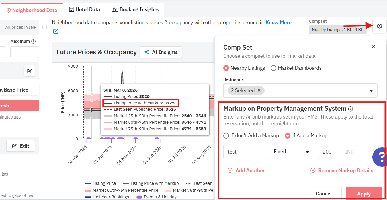
How to Apply Markup / Markdown to the Recommended Prices
- Click on the cogwheel icon on top of the Future Prices chart
- Under Markup on Property Management System, tick I Add a Markup.
- Select Percentage or Fixed from the dropdown
- Enter a numerical value in the field below
- Click Apply
- In the Future Prices chart, you will start seeing a Listing Price with Markup line
- To reflect this in the Competitor Calendar, click on the Edit Markup, Fee Details button and apply the same.
- Table view: A new row will appear below Your Listing row
- Graph View: A light blue line will show up in the graph
You can watch the video guide here.
Occupancy Chart
The Future Occupancy Chart shows you the average occupancy in your area for each date over the next year in red, overlaid with any existing blocked dates for your listing in grey. You can also see which dates you have set as unavailable (unbookable) in lighter grey.
Data Overlay:
- Add Last Year Data
- Last year today - This data shows the current market occupancy last year on the very same day. With this data, you can better evaluate whether bookings are coming in slower, faster, or at the same pace as last year.
- Last Year Final - This data provides the final occupancy of the past year, which can also provide insights on the occupancy level for far-out dates.
- Add Pickup
- This data illustrates how many bookings have come into the market in the last 7 days.
Market History
The Market History chart shows you your market's Occupancy, Booking Window, Average Daily Rate (ADR), and Length of Stay. By default, the chart shows data for last 1 year but can be changed to show data for the last 2 years.
To view each metric above, simply click the option on the top of the chart.
Market Occupancy
Market Occupancy displays the average monthly occupancy in your area.
- This shows you the average (mean) occupancy of other listings in your area for each month in the past 12 or 24 months.
- This can be helpful in understanding how well your listing is doing against your competitors in terms of nights booked per month.
Market Booking Window
Market Booking Window displays how far in advance dates are booked in your market.
- This shows you the number of days between when the date the booking was made and the first stay date for that booking.
- The value displayed is the median (middle point) Booking Window in your area.
Market Length of Stay
Market Length of Stay displays the number of nights booked per booking.
- This shows how many nights a clients are booking the properties per reservation.
- The value displayed is the median of the how long clients stay per booking for listings in your neighborhood.
Market ADR
Market ADR displays the average daily rates for competitors near your listing.
- ADR is the the total rent divided by the number of nights booked within the given month.
- This graph shows the median of the average nightly prices that vacation rental properties gets for each booking.
You can select whether you want to see the data for the last year or last two years on the upper right section of the chart. You can also download the data in CSV format.
You can watch the video guide here.
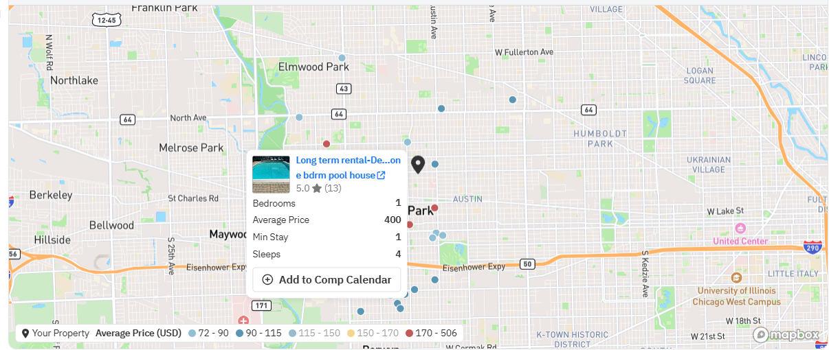
Competitor Map
The map view shows you the approximate location for the listings in your neighborhood along with the average daily rates for the next 360 days. You can zoom in to see more detail on listing locations, and hover over any bubble to see the average rate. The color of each dot is determined by the listing's average rate. The map also contains the listing name, bedroom count, average price, and min stay in hover tool tip (Airbnb listings only).
You can now click legends to select/unselect individual percentile categories on the map. Double-click a legend to isolate just that category
You can also click the +Add to Comp Calendar button on the hover tool tip to add the listing details to your competitor calendar graph.
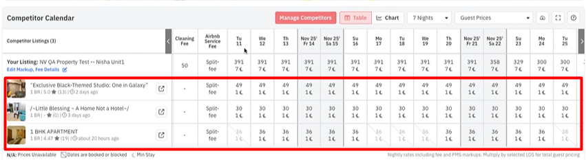
Competitor Calendar
This feature allows you to compare your listing with other specific listings in your neighborhood (up to 10 listings).
You can see the following information in the feature -
- Your Listing's Daily Future Price: The prices are shown in bold, unavailable dates are greyed out and clicking on listing name in table will take you to the listing on portal
- Competitor's Daily Future Price: The prices are shown in bold, unavailable dates are greyed out and clicking on listing name in table will take you to the corresponding Airbnb/Vrbo link of the listing
- Availability: Any date that is striked-off is not available or booked and the prices shown are the "booked prices" (prices last seen when the dates were still available).
- Cleaning Fee: This is only available for Airbnb listings. You can see how much your competitors are charing for cleaning fee. Its the extra amount on top of the nightly prices.
- Airbnb Service Fee: This is only available for Airbnb listings. This tells you about the airbnb service fee structure of the listing in consideration. It can either be Split-fee or Host-only fee.
- Prices Last Refreshed: This tells you about the last time prices were refreshed. Please note that availability, cleaning fee, and airbnb service fee are refreshed on a different frequency.
- Minimum Stay: This shows the minimum stay required for each date of the listings in the Competitor Calendar.
- First image of the listing on Airbnb: This is only available for Airbnb listings. This shows the first image displayed for the listing.
Guest Prices
When guests book your property on Airbnb, they see prices inclusive of all fees (cleaning fee, airbnb comission), markups added on PMS/Channel Manager side, and discounts. This price is different from your nightly rates, which doesn't include these additional price items.
In Competitor Calendar, now you can switch between these views (Host Prices vs Guest Prices), and see what your prices look like from a guest point of view. Guest Prices can include taxes and other fees. The calculation varies depending in your local regulation. For more information, you can check: Airbnb - Taxes for guests
Editing Markups and Other Fees
To be able to calculate Guest Prices for your own listing in PriceLabs, you need to tell us your airbnb Cleaning Fee, and commission along with any markups on PMS/Channel Managers. Note that we do know for competition automatically from our scrape data.
- To do this, click Edit Markups, Fees Details under Your Listing.
- Input the appropriate information and click Apply.
Example: How the nightly price is calculated
Say a guest is booking a 3-night stay. Your nightly rates for those dates are:
- 10 Jan: 100
- 11 Jan: 120
- 12 Jan: 110
You’ve added a 10% markup, and your cleaning fee is 50.
Total stay cost = (100 + 120 + 110) + 10% markup + 50 cleaning fee
Total stay cost = 413
Since this is a 3-night stay, the average cost per night is 413 ÷ 3 = 138. That’s the number shown on 10 Jan in the calendar.
Total stay cost = 413
Since this is a 3-night stay, the average cost per night is 413 ÷ 3 = 138. That’s the number shown on 10 Jan in the calendar.
When you move to 11 Jan, the system looks at the next three nights (11, 12, 13 Jan) and recalculates the average based on that set of dates. That’s why the number can change day-to-day when you’re using an LOS longer than 1 night.

Note: The market rates (comp listings) include all add-ons, such as PMS markups, promotions, and extra-person fees. Basically, the quote before taxes.
What this means for you
Until now, the calendar showed plain nightly rates.
With Airbnb shifting to all-inclusive prices, the cleaning fee now affects the per-night cost, which naturally brings LOS into play. A cleaning fee is charged once per stay, so shorter stays carry more of that cost per night than longer stays.
You can still track daily prices the same way as before, but the number you see will match the LOS you’ve selected.
- Want to know what a guest pays for a single night?
Select LOS = 1 night.
- Want to see what a guest pays per night for a 3-night stay?
Select LOS = 3 nights. The calendar will show the total booking cost (including fees and markup) divided by 3.
Once you set the LOS that matters to you, the calendar will always reflect the average per-night cost for that stay length.
Other Features
- You can switch to a Graph view using the "Table/Graph" button, but that will only have Daily Pricing information.
- You can download the data for your own analysis using the 'Download CSV' "
" button on the top-right.
Adding Listing To the Table/Graph
To select the listings to be added to your Competitor Calendar, first click on the "Manage Competitors" button and select up to 10 listings from the dropdown.
After you have selected the listings, click on "Update Data" to see your competitor's rates, minimum stay, and availability:
You could add an Airbnb/VRBO listing to your Competitor Calendar following the steps below:
- Click on "Manage Competitors"
- Click Add Manually
- Enter the link for the listing, then click on 'Verify' and finally 'Add Listing'
When adding a listing to your Competitor Calendar, please note the following:
- Only listings within a 200 KM radius can be added.
- Listings should have a similar bedroom size.
- Listings must be on the same platform (Airbnb/VRBO).
Arranging the Order of the Listings
To select the order of how the listings shown in your Competitor Calendar, first click on the "Manage Competitors" button and move the listings up and down using the dots icon on the left side of the listing. Then, click "Update Data".
Market Overview
The Market Overview chart provides the precise count of listings by the number of bedrooms and displays the average low, mid, and high prices for these listings, considering their prices over the past 180 days and for the next 180 days. Among the 126 one-bedroom listings in this area, the average prices were $181 per night at the lower end, $201 - $229 per night in the middle range, and $277 per night at the higher end of the pricing spectrum.
Unlike with the Base Price Help tool, we do not have a require the listing be active for the last 6 months and next 6 months to be included in the compset for Neighborhood Data as we can still get useful information from these listings. This means that the number of compset that you see in the Base Price Help tool may be lower that the compset in the Neighborhood Data Tab.
You can watch the video here.
Minimum Stay Settings
The Minimum Stay Settings chart offers a preview of the stay restriction settings that have been applied to your listing for the chosen time frame. You can also view which rule is being applied on a specific day by selecting "Show Reasons".
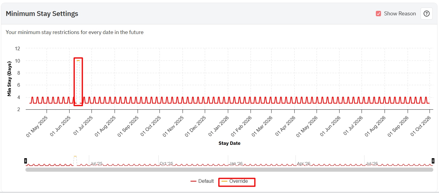
You can watch the video guide here.
Download CSV
You can also download all the data in this tab in a CSV file.
Important Notes:
- Neighborhood Data shows aggregated data from a limited number of listings in the immediate surrounding area, and it is not intended for market research.
- This aggregate data might contain listings with different fee structures - fees are usually added on top of the prices used for this analysis, but not always. Therefore, there is some uncertainty in the data, and these numbers should be interpreted as trends.
- Rates on the Map and Compare Competitor Calendar are updated every 5 days, while new listings are added and refreshed every 15 days. Occupancy, on the other hand is updated every 2 days.
- Read more about how you can make the most of data visualizations in PriceLabs.
Related Articles
Hotel Rate Shopper (Listing Hotel Data)
Knowing how hotels and short-term rentals are performing in your area is essential because potential guests consider both options when planning their vacations. Keeping track of both types of accommodations allows you to stay competitive in your ...Setting your base price
What is the Base Price? Your base price is the average nightly rate you'd charge across the whole year - not your peak price, not your floor. It's the single number where PriceLabs applies the adjustments to account for demand, seasons, and market ...'AI Insights' in Neighborhood Data: Understanding Price and Occupancy charts
At PriceLabs, our mission is to democratize revenue management. This is why we’re thrilled to announce that we’re now leveraging Generative AI to turn complex data into simple sentences. We can convert a data-rich graph into a clear text paragraph ...About Hyper Local Pulse and FAQ
Our most advanced pricing algorithm, designed to adapt to your local market with precision What is Hyper Local Pulse? Hyper Local Pulse is a superior version of our existing pricing algorithm. It uses advanced techniques for demand forecasting and ...Understanding the Market Dashboards
Market Dashboards are fully automated personalized dashboards that can help you track your location’s STR booking data through easy to digest graphs and insights. New user accounts with listings imported in PriceLabs will be credited with 1 free ...
Sign up for training
To help you get the most out of PriceLabs, we have training webinars in English, Spanish, Portuguese and French. Click here to Register.