Market Dashboard in Action: Real-Life Applications and Case Studies
This page delves into the Market Dashboard, highlighting key metrics and trends to provide a clearer understanding of each chart and its use cases.
Listing Map and Comp Sets
Location
The map will show the approximate location of the active listings in the report area.
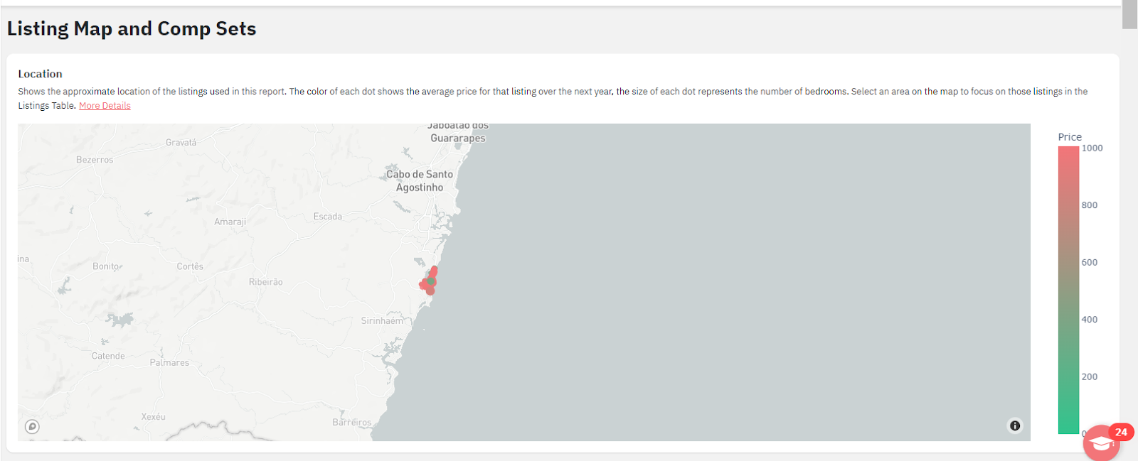
You can hover over each dot on the map view to see how many bedrooms that listing has and the average rate over the next year.

The size of each dot is determined by the number of bedrooms the listing advertises, while the color corresponds to the listing's average rate. The tool in the top right of the map will let you pan, zoom, and select areas on the map.
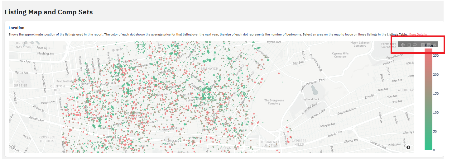
- If you ask why some listings included in the selected radius are not displaying, it's because the dashboard has reached the maximum listing count.
- The defined dashboard radius is the maximum limit, and we get the closest x number of listings from its center point.
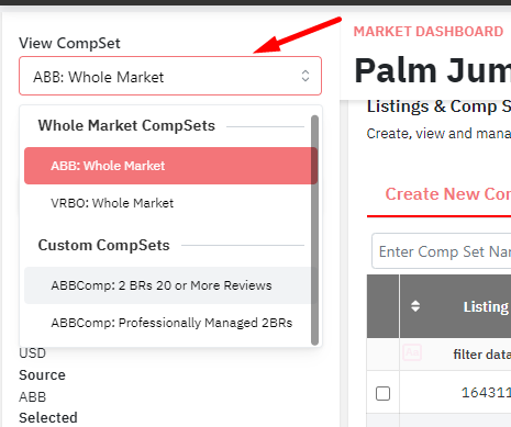
Listings & Comp Sets
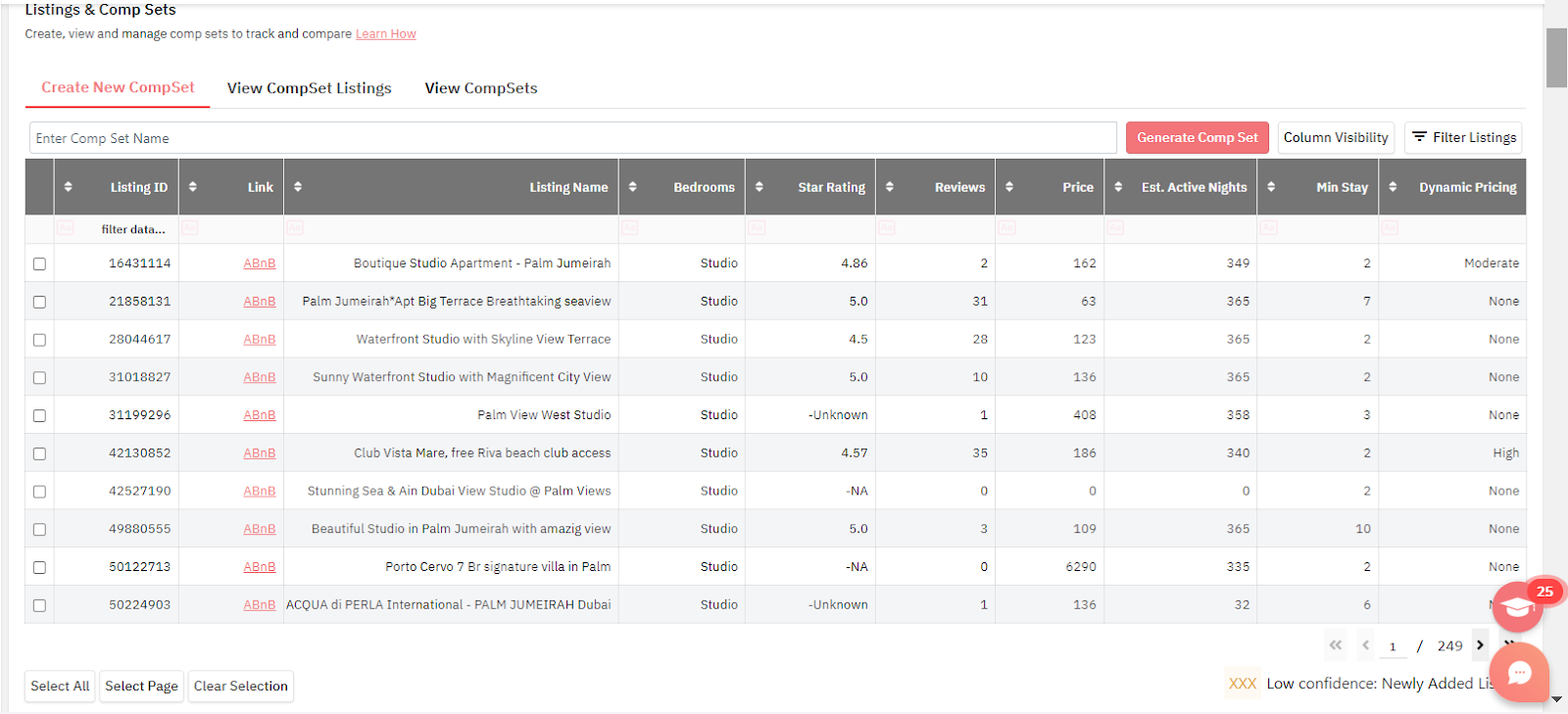
In this section, we can create comp sets. A comp set is a group of properties we want to consider specifically when checking KPIs and data from the market rather than the whole market (1000, 5000, or 1000 listings).
More about How to create and view Custom Compsets on our KB article: https://help.pricelabs.co/portal/en/kb/articles/market-dashboard-how-to-create-and-apply-custom-compsets
When you ask about data from a specific listing, you can create a comp set that includes only this particular listing and select it under the View CompSet section. Like this, the KPIs shown will be only related to that listing.
Use cases:
- To narrow down the search and analysis to a specific set of listings.
- You can compare how your listing is priced compared to the compset and use it under Neighbourhood data.
- You can also use a compset in Portfolio Analytics to compare your listings pricing with the market.
- You can create compsets based on bedroom count, beach front properties, Sea view properties, properties with specific Amenities which your listing has too.
Market Summary
Estimated Avg Revenue
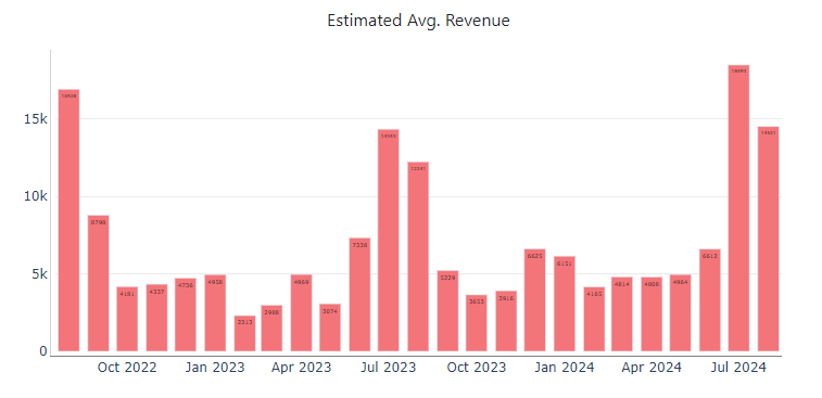
- This graph will show an estimated revenue average for all the filtered listings in the past months.
- Why “Estimated”? - We mention “Estimated” due to limitations in the scraping of data from Airbnb, there are several factors that we are not able to scrape that would make the Revenue different: Blips in scraping, block removal logic not working for the listings, majority of bookings coming from other site with different prices, special commissions and fees applied on the OTAs, etc. As a result, we are able to show an estimation, but never the final, exact value.
- Hovering over any column on this graph will show the average estimated value for that specific month
- You can click and drag on this graph to Zoom in, double click zooms out
- The estimated revenue shown is for the listings currently filtered on the MD, it can be whole market, a comp set, only a specific bedroom count, etc.
Use cases:
- First, you can find out what months of the calendar are the ones with the highest revenue, and adjust accordingly (such as applying a seasonal minimum price to ensure a minimum level of revenue).
- It easily shows what months would be high season and low season for this market. It also helps set expectations, and better prepare for each month’s results.
- Following above points, if the revenue generated for a specific month is high then the pricing for that month should be high as well to generate maximum revenue.
Avg RevPAR
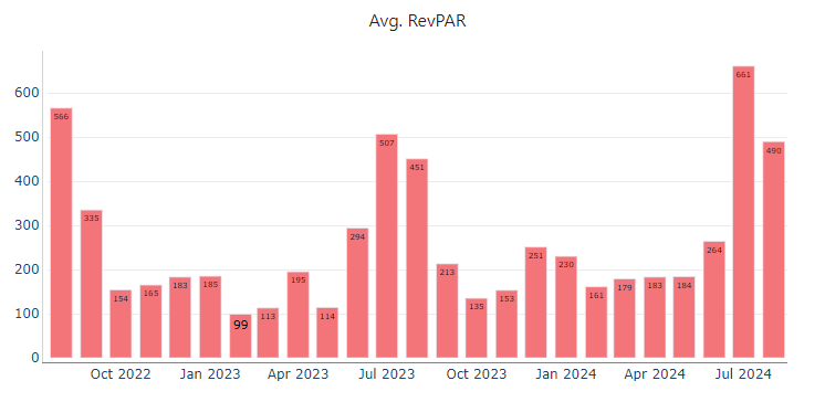
- This graph shows the Estimated Average Revenue Per Available Night (calculated by dividing the total revenue by the number of available nights or by multiplying the occupancy rate and average daily rate)
- RevPAR allows you to account both for the occupancy rate and ADR simultaneously. This is much more powerful than looking at those 2 metrics alone.
Use case:
- If your RevPAR is high compared to the previous months, but you are not generating enough revenue (profits), you can then check Occupancy and ADR chart as RevPAR is dependent on these both.
- At times RevPAR is high because of high occupancy, however just having high occupancy does not guarantee max revenue.
- In this case you need to focus on increasing the ADR even if it slightly affects the occupancy.
- You can set clear expectations of what minimum price you are willing to rent the property in order to generate expected returns.
- At times RevPAR is high because ADR is high but is not generating occupancy in a way leading to less returns.
- This helps us navigate through the portfolio and check which is the exact area of improvement.
Avg Occupancy
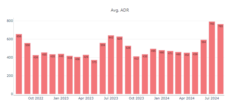
- ADR is the Average Daily Rate. This graph shows what’s the average rate per day for an entire month
- Similar to the RevPAR graph, but this information doesn’t consider the occupancy rate for that specific month.
- These are the average daily rates for that month, but doesn’t mean that the bookings came at those same prices.
Use Cases:
- You can take advantage of this by seeing what were the average daily rates for that specific month and get a better concept of the price range that specific market used.
- You can compare this chart with occupancy chart and see which month got higher occupancy letting us understand the optimum ADR we should have.
- If in case market ADR is high and also the Market occupancy is high, if you compare this with your listing and if both the factors coincide, then you can choose to increase your listing ADR higher than the market to generate more revenue.
Median Booking Window
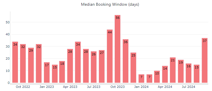
Use cases:
- This data helps you better understand the market's booking pattern and how aggressively you should price your listing.
- In this case, for October 2023, you can see that the median booking window is 56 days. If it’s already September 2024 and the calendar is still pretty empty for October, then you have already missed the booking window, and it might be challenging to try to fill the month with last-minute bookings. So, for this, you can consider lowering your prices by maybe applying the “Super Aggressive Discounting” OBA to try to fill the calendar.
- On the other hand, for November and December, you can check the rates for these months and make sure you are competitive enough to get bookings.
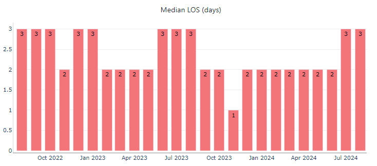
Median Length of Stay (LOS)
Summary Table
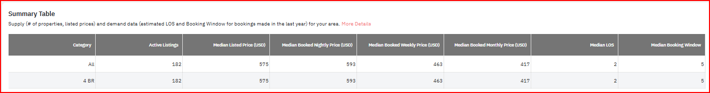
- Active listings: Total number of listings in the market as per the bedroom count.
- Median Listed price: Daily median price listed for the properties over next 360 days.
- Median booked nightly price: Daily median price with which listings were booked over the next 360 days.
- Median booked weekly price: Median price for booking with 7 days or more Length of stay over next 360 days for stay dates.
- Median booked monthly price: Median price for booking with 30 days or more Length of stay over next 360 days for stay dates.
- Median Length of stay: Median LOS for bookings made in last 360 days
- Length of stay: Total no. of booked nights in 1 booking.
- Median booking window: Median booking window for bookings made in the last 360 days.
- Booking window: How far in advance was the booking made.
Supply and Demand
Ave Bookings per Listing
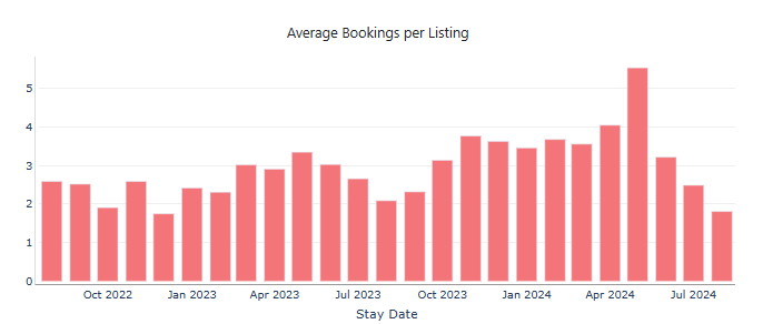
- This chart helps us know how many bookings came in during the specific month depending on the active no. of listings.
- For example, if we have 100 active listings in the market, and if the market receives 100 bookings in that span, then the average bookings per listing is 1.
- This does not mean every single listing is getting booked but there are potentially enough bookings to have your listing booked.
Use case:
- You can understand whether the supply in the market is more than the demand or vice versa.
- If the average booking per listing is less than 1, then it would indicate that the market occupancy is going to be low as the bookings received in the market are going to be less than the total listings available to be booked.
- Possibly during the slow season the average might go below 1.
Active Listings
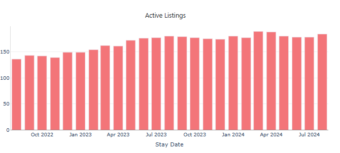
- This chart shows the number of active listings in the market during the indicated month.
- Hovering over the chart will give you an estimated no. of listings which were active on booking platforms.
- This data is available in weekly and monthly format.
Use case:
- You can check this graph to understand if the market is saturated with max number of listings.
- If the bookings in the market do not increase, but if the active listings in the market have significantly increased over time, it will impact the market occupancy. This will eventually lead to less demand and more supply.
- With the above parameters you can analyze whether you should invest in a property in this market, or why the occupancy rate of your listing has reduced today compared to past months.
- This will be more evident during the slow seasons.
Price and Occupancy Trends
Key Future Dates

- In this section, we spot some dates in the upcoming months/year where the percentage occupancy for the market is significantly higher compared to surrounding dates.
- The dates are shown in a descending order of percentage occupancy difference so you can see the highest demand date on the top of the list.
- Looking at the dates and period length, you can take decisions on updating prices or minimum stay requirements for their listings in said market.
- You can then look at the Future Occupancy and Future Prices graph below to look for more information on the market performance on and around the highlighted dates.
Future Occupancy, Bookings and Cancellations

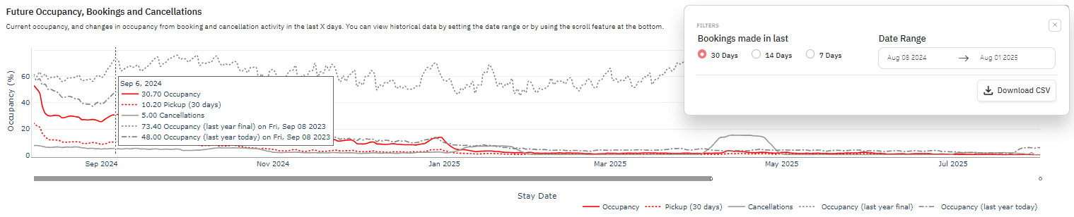
- In this graph, we show the market performance for the next 1 year by default. The date range can be changed from the orange hamburger menu.
- You can also double click on the graph to see the market data for the past 2 years or use the grey slider below the graph to change the date range seen on the graph.
- The pickup line is set to 30 days (by default) and can be changed to 30/14/7 days from the orange hamburger menu in the ‘Bookings made in the last” section.
- You can add/remove specific lines by clicking on the legend below the x-axis of the graph
- The market occupancy data can also be downloaded in a CSV table if you want to process the data further as per their preference.

- When you place your cursor on a specific date on the graph, you can see the data for the selected date for various parameters.
Solid Red Line (Future Occupancy):
- Shows the market’s occupancy as of today for the next 1 year.
- Can be used to spot/compare upcoming peak demand dates in the market and how occupied the market is as of today for the future dates.
Dotted Red Line (Pickup):
- Shows how many bookings (from the market occupancy as of today) were made in the last 30 days.
- Can be used to determine if the market in particular sees a bunch of last minute bookings happen or not.
- Can be changed to look at the pickup in last 14/7 days as well from the orange hamburger menu
Solid Grey Line (Cancellations):
- Shows how many listings in the market have seen cancellations happen in the past 30 days.
- The range changes based on the pickup date range selection.
Dotted Grey Line (Last Year Final):
- Shows how many listings in the market were finally occupied when the similar date/day of week arrived.
- Can be viewed with the Semi Dotted Grey Line (Same Time last Year) to judge the gap between market occupancy and how more bookings came in as the date got closer.
Semi Dotted Grey Line (Last Year Today or Same Time Last Year):
- Shows how many listings in the market were occupied at the same time last year.
- Can be compared to Solid Red Line (Future Occupancy) to gauge if the market is performing behind/ahead of the occupancy levels of last year.
- Can be compared to Dotted Grey Line (Last Year Final) to gauge if the final occupancy levels are reached already or if there's a possibility of more bookings coming in as the dates get closer.
- Based on the market’s performance for future dates vs last year, you can make decisions on pricing/min stay settings for their listings.
- If the market is performing behind last year, prices/min stays can be relaxed to favor occupancy in a slower market.
- If the market is performing ahead of last year, prices/min stays can be increased to favor revenue in a faster market.
Future Prices
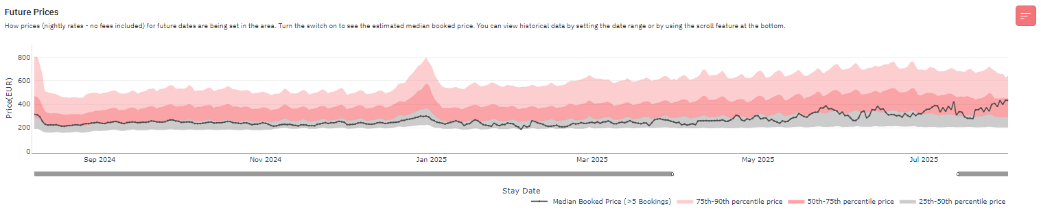
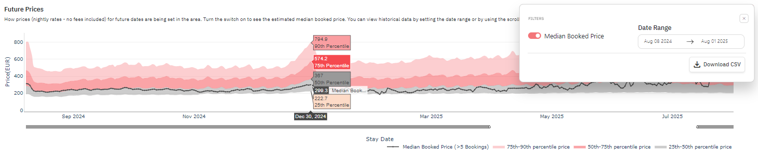
In this graph, we show the future prices seen on the listings in the market for the next 1 year by default. The date range can be changed from the orange hamburger menu.
You can also double click on the graph to see the market data for the past 2 years or use the grey slider below the graph to change the date range seen on the graph.
The median booked price for the market can be enabled by clicking the orange hamburger menu and enabling the toggle.
You can add/remove specific prices by clicking on the specific legend below the x-axis of the graph.
The future prices data can also be downloaded in a CSV table if you want to process the data further as per their preference.
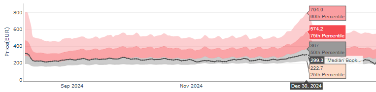
- When you place your cursor on a specific date on the graph, you can see the prices for the selected date for various percentile categories as well as the median booked price.
- The different percentiles on the graph show the prices seen for the listings present in the market in the 25-50th percentile, 50-75th percentile and 75-90th percentile ranges.
Dotted Maroon Line (Median Booked Price):
- The line is only seen if there are more than 5 bookings for the listings in the market for that date.
- The dotted maroon line shows the median booked price (50th percentile) for the booked listings in the market for that date.
- This line can show the variation between the listed/asking price for the listings and the sold price (price at which a majority of listings are getting booked at)
- You can use this data to get more information about the price point at which most listings are getting bookings and adjust their prices accordingly (if required)
Day of Week Occupancy

- This chart is used to check market occupancy based on day of the week.
- In the above chart, Friday, Saturday and Sunday have a slightly high occupancy compared to other days.
- This shows that you will be having more bookings on these 3 weekend days.
- You can view this for the last 365 and 30 days.
Use case:
- In case the occupancy on weekdays is very low compared to the weekends, then it indicates that the market is weekend based.
- This helps you price up your property on weekends specifically and generate more revenue on weekends.
- You can lower the prices on weekdays to increase booking rate.
Day of Week Price Factor
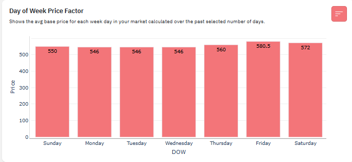
- This chart shows price fluctuations based on day of the week.
- In this chart you can see all days of the week have a similar price range. So there is no need to increase pricing on weekends.
- This chart also goes hand in hand with the day of the week occupancy.
- If the weekend occupancy is high, the weekend prices will be high too. As it is based on supply and demand.
Use case:
- In the above chart if the weekend pricing was high, then your listing’s pricing is supposed to be high too. This will help you generate more revenue.
- If your weekend pricing is low, then you will be underselling your property for high value days.
- Same in case of weekdays, if the weekdays have lower pricing and if your listing is on a higher end, you will not end up receiving any bookings as your listing will come in the most expensive listings on lowest demand days of the week.
Length of Stay and Booking Window Trends
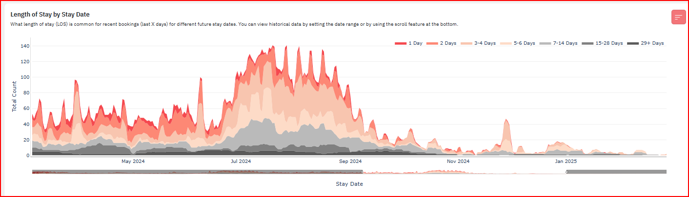
- You can use this graph to understand the demand for different length of stay on key dates.
- Once you hover over the chart you will see the frequency of Length of stay on indicated days. In the above chart the most frequent length of stay is in peach color which is 3-4 days.
- It helps in understanding how the length of stay in the market transitions over a period of time, and what is the optimum length of stay for the high season to generate more revenue.
- You can check the data for the last 7, 14 and 30 days along with the max data available.
Use case:
- This can be used to view the Length of stay for the entire slow/high season together and understand the Length of stay with maximum bookings, along with average nightly price for that day.
- Setting up minimum stays for the upcoming season based on past data.
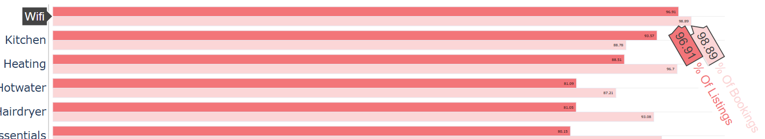
Amenities
The Amenities graph/table will show you the percentage of listings that have an amenity, compared against the percentage of bookings (in the last 30 days) that were made on a listing with that amenity.
This will help you assess the popular or high-demand amenities in your market. In the Amenities section, you'll find two tables:
Common Amenities
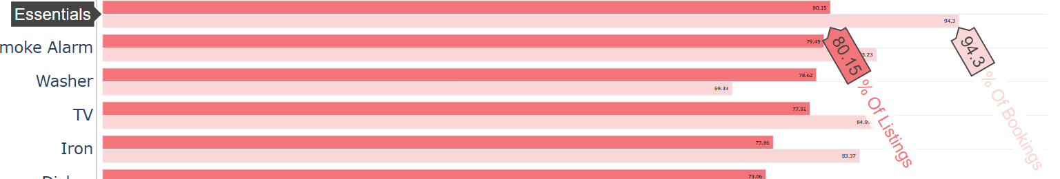
The Common Amenities chart ranks amenities by the percentage of listings (in red) that offer them, compared to the percentage of bookings (in pink) that are searching for those amenities.
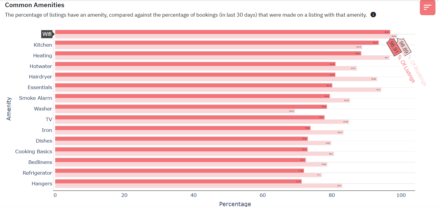
For example, in the chart below, you'll see that WiFi is the most common amenity offered by listings in the market. 96.91% (in red) of listings claim to offer it, while 98.89% (in pink) of bookings in the past 30 days were searching for WiFi. Although demand for WiFi is high, most listings in the market are also offering it.
Another example from the same table shows that 94.3% of bookings made were looking for the 'Essentials' amenity, but only 80.15% of listings in the market offer it. This suggests that 'Essentials' is one of the most sought-after amenities, yet a significant number of listings still do not provide it. If your listing doesn't yet include 'Essentials,' adding this amenity could potentially increase your chances of booking.
Desired Amenities
The Desired Amenities chart ranks amenities based on the largest difference between the percentage of listings that offer them and the percentage of bookings that seek them. As shown in the chart below, 'Self Check-in' is the most in-demand amenity, with the biggest gap between bookings and listings that report having it, followed by 'Essentials,' and so on. This highlights which amenities are highly sought after and suggests that adding them to your listing could potentially boost its performance.

Policies and Fees
Weekly Discounts
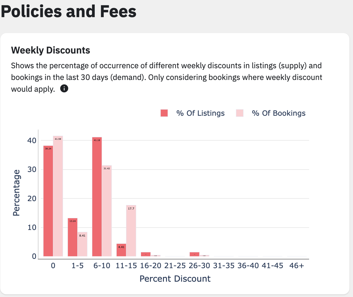
- This graph will show the percentage of different weekly discounts in listings and bookings in the last 30 days. Only considering bookings where weekly discount would apply, meaning bookings that can have a weekly discount.
- The % shown are for the listings currently filtered on the MD, but it can be changed for the whole market, a comp set, only a specific bedroom count, etc.
- This can be useful in figuring out which percentage of the weekly discount has more bookings and, thus, in picking that percentage to increase bookings in our listings.
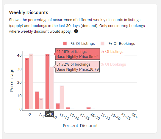
- Using this as an example, you can see that 41.18% of the listings have between 6% and 10% weekly discount, but only 31.72 % of the bookings in the same range. Looking at the graph, most of the bookings (the lighter shade) were made for properties with 0% weekly discount.
- One takeaway you can take from this is that for this particular market, it’s ok to not have a discount, and if you’re going to have one, then it’s better for it to be between 6% and 15%, as you can see more bookings proportionate to the number of listings.
Monthly Discounts

- Similar to the weekly graph, this one will show the percentage of different monthly discounts in listings and bookings in the last 30 days. Only considering bookings where monthly discount would apply, meaning bookings that can have a monthly discount.
- The percentages shown are for the listings currently filtered on the MD, but it can be changed for the whole market, a comp set, only a specific bedroom count, etc.
- This can be useful in figuring out which percentage of the monthly discount has the most bookings and, thus, in picking that percentage to increase bookings in our listings.
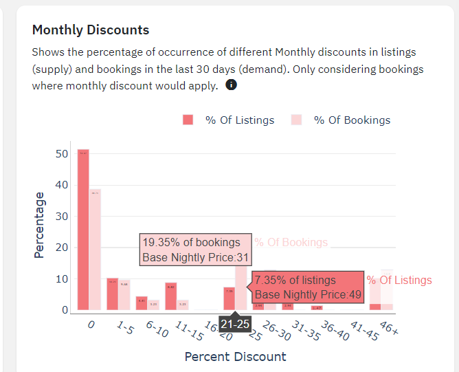
- Using this as an example, you can see that 7.35% of the listings have between 21% and 25% monthly discount, but 19.35% of the bookings made for this market are with this discount, which would indicate this is an appealing offer. Looking at the graph, most of the bookings (the lighter shade) were made for properties with 0% monthly discount.
- One takeaway you can take from this is that for this particular market, it’s ok to not have a discount, as over 50% of listings don’t offer one, and still get booked at an ok rate. If you’re going to have one, then it’s better for it to be over 21%, as you can see more bookings proportionate to the number of listings starting from this discount point onwards.
Cleaning Fees

- This graph will show the percentage of occurrence of different cleaning fees in listings vs bookings in the last 30 days.
- The percentages shown are for the listings currently filtered on the MD, but it can be changed for the whole market, a comp set, only a specific bedroom count, etc.
- This can be useful in deciding to use a cleaning fee, and if doing so, which price range would maximize the bookings.
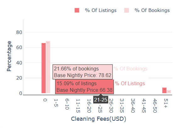
- Using this as an example, you can see that 15.09% of the listings have a cleaning fee between 21 and 25 USD, but 21.66% of the bookings are made for listings with a cleaning fee between these values, which would indicate this is an appealing offer as well. Looking at the graph, most of the bookings (the lighter shade) don’t have a cleaning fee in this market, and proportionately have more bookings, which would indicate listings with no cleaning fee are more popular.
- One takeaway you can take from this is that for this particular market, it’s ok to not only not have a cleaning fee, but it’s actually the preferable option with the most bookings. In case you need to have a cleaning fee in this market, then the best option would be between 21 and 25 USD, as all other options give worse results.
Cancellation Policies
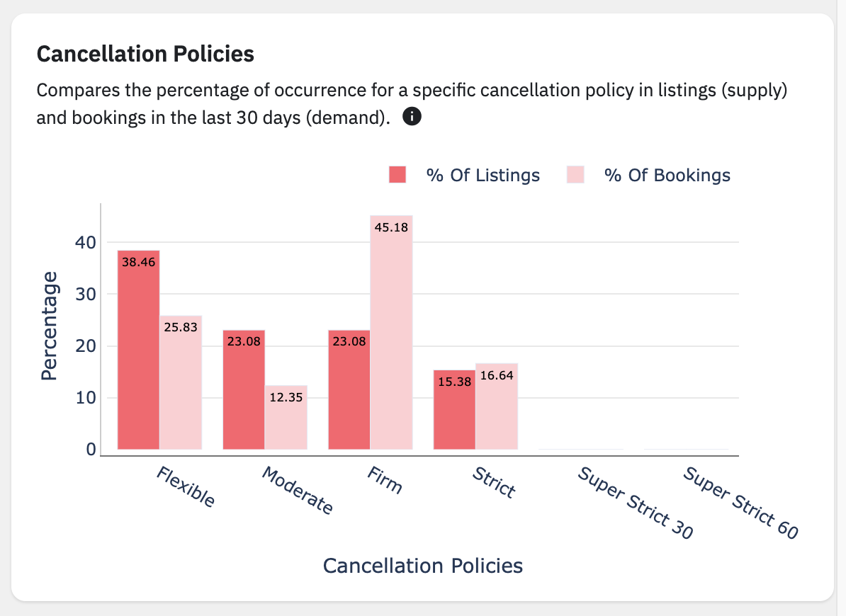
- This graph compares the % of occurrence for a specific cancellation policy in listings vs bookings in the last 30 days.
- The percentages shown are for the listings currently filtered on the MD, but it can be changed for the whole market, a comp set, only a specific bedroom count, etc.
- This can be useful in checking which cancellation policy has the most bookings. Thus, a cancellation policy can be applied without risking hurting occupancy.
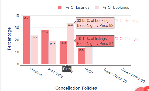
- Using this as an example, you can see that only 19.12% of the listings have a Firm cancellation policy, but 31.99% of the bookings are made for listings with this policy and 23.49% of bookings are made with listings with Strict Policy, which is over 50% meaning that it’s better in this market to have a firm or strict cancellation policy, as most of the listings have a flexible or moderate one, but get fewer bookings according to the graph.
- One takeaway you can take from this is that for this particular market, it’s better to have a policy that is not too permissive, as this increases the booking retention for the public travelling to this area.
Max Number of Guests
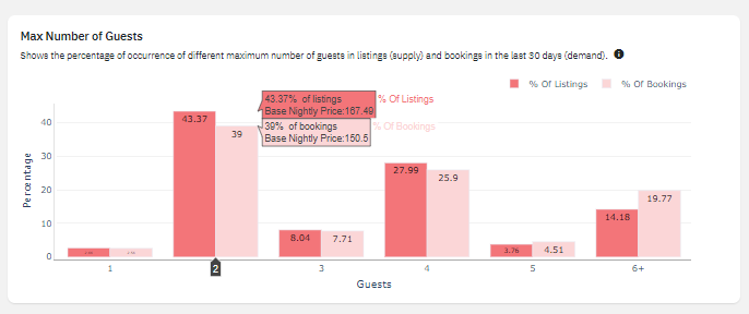
- This graph shows the distribution of listings and bookings based on the maximum number of guests that properties can accommodate. It compares the percentage of listings available with the percentage of bookings made in the last 30 days for different x number of guest. You can also see the Average Base Nightly Price of the % of listings compared to the actual booked.
- As an example, based on the graph, 43.37% of the market consists of 2 guest max listings, and 39% of the total bookings got booked by these listings. On the other hand, 1 guest max listings only consist of 2.66% on your market and 2.56% of the total bookings were booked on.
Use cases:
- You will know which is the popular Max Number of Guest listings. In this case, 2-guest max listings are showing stronger demand than those 1-max, 3-max or 5-max guest listings.
- You can plan which maximum number of guest listings to focus on. You can also see which maximum number of guest listings are fewer in the market and their bookings, giving you information for possible premium increases for groups specifically looking for such listings.
- Example: 5 guests max listings on the market is only 3.76 but 4.51% of the total bookings of the market booked these listings so there could be an idea that 5 guests max listings has a fewer supply but a bigger demand giving a possible premium increase if it fits your strategy.
Extra Person Fee
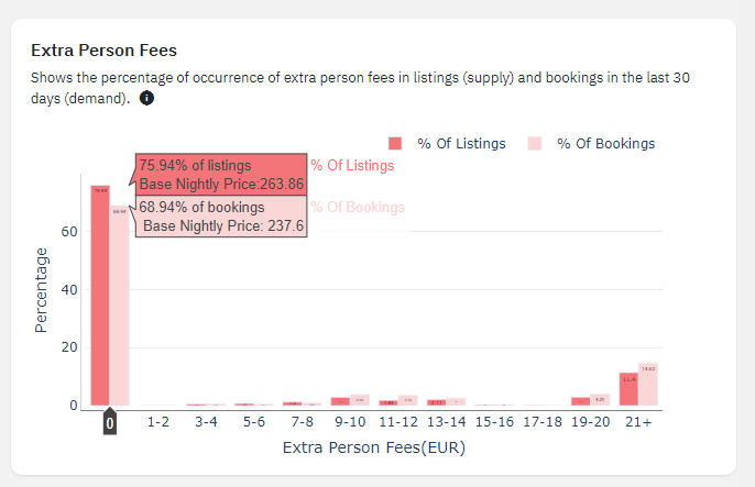
- This graph shows the occurrence of Extra Person Fees in listings and bookings over the last 30 days.
- As an example, you can see that 75.94% of total listings in your market does not have extra person fee, and 68.94% of the market’s total bookings made over the last 30 days booked these listings.
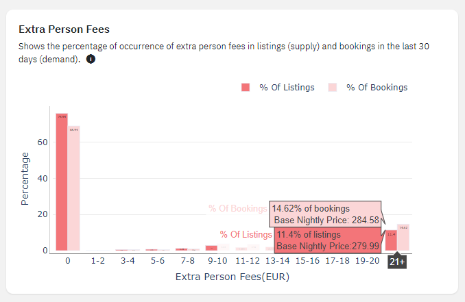
- You can also see that 14.62% of the total number of listings in the market charges 21+ EUR, and 11.4% of the market’s total bookings made over the last 30 days booked these listings.
- This gives you an idea of setting competitive Extra-Person Fees. By using this graph, you can see the demand for listings booked with extra-person fees and their charges. At this point, most of the listings(75.94%) and bookings(68.94%) do not charge Extra-Person Fees.
Use Cases:
You can also learn from this graph that a sharp drop in both listings and bookings as the extra person fee increases may suggest that setting higher fees may deter bookings.
This graph can help you such that If you really need to set an Extra Person Fee and your current extra person fees are higher than the market standard, consider reducing them to align with the most common range.
Related Articles
Market Dashboard Use Cases
Estimated revenue The Market Dashboard allows you to evaluate your listing's performance by comparing its revenue with market averages for the selected period. If your earnings are below the market average, you can adjust your pricing strategy to ...Market Dashboard: Use Case Guided Templates
Market Dashboard has a use case–based guided experience designed to make it easier for you to find insights and take action quickly. Instead of navigating a full dashboard with many charts, you can start by selecting a primary goal from a predefined ...Decoding Portfolio Analytics: How KPI & Historic Report Drive Smarter Decisions (A Compilation of Case Uses)
Understanding how to navigate and reach the graphs in Portfolio Analytics is important. However, knowing about how you can use this information to better set up your listings is equally important. So, let us go over some of the case uses for ...Market Dashboard vs Revenue Estimator Pro
Both Market Dashboard and Revenue Estimator Pro are two powerful solutions offered by PriceLabs that are designed to provide actionable insights, but they cater to different needs. Revenue Estimator Pro focuses on delivering insights on potential ...PriceLabs Market Dashboard: Billing, Subscription, Cancellation, and Invoices
Market Dashboards can be incredibly powerful as you set up your pricing strategies to maximize revenue. Market Dashboards are fully-automated personalized dashboards that can help you track your location’s STR booking data through easy to digest ...