Mastering Portfolio Analytics: Using Pacing Reports to Track and Adapt (A Compilation of Case Uses)
Understanding key performance metrics is crucial for optimizing revenue management strategies when managing a portfolio of rental properties or hotels. Four essential metrics in this context are Listed Price, Occupancy, Average Daily Rate (ADR), and Revenue Per Available Room (RevPAR). These metrics offer insights into property performance and guide decisions to enhance profitability.
Listed Price
Definition: Listed Price is the current rate at which a property is offered for booking, visible to potential guests on booking platforms.
Interpretation: Comparing the Listed Price with historical data or market trends helps assess competitiveness. Significant deviations from similar properties or previous pricing may signal the need for adjustments. Pacing Reports allow users to track this metric against market benchmarks, providing context for pricing decisions.

Occupancy
Definition: Occupancy is the percentage of available rooms or units that are booked over a specified period, reflecting demand for the property.
Interpretation: While higher occupancy indicates strong demand, it must be balanced against the rates charged. Pacing Reports help track occupancy trends over time and compare them with past performance and market averages, aiding in pricing and marketing strategy adjustments if needed.
ADR
Definition: ADR represents the average revenue earned per room sold, calculated by dividing total room revenue by the number of rooms sold within a specific period.
Interpretation: A high ADR indicates successful pricing but must be considered alongside occupancy rates. If ADR is high but occupancy is low, it could mean that prices are too high. Pacing Reports facilitate comparisons of ADR against market rates and historical data to optimize revenue potential
RevPAR
Definition: RevPAR combines Occupancy and ADR to measure overall revenue efficiency, calculated by multiplying ADR by the occupancy rate or dividing total room revenue by the total number of available rooms.
Interpretation: RevPAR is a comprehensive indicator of property performance, showing how well inventory is utilized. Low RevPAR might suggest either low occupancy or inadequate pricing. Pacing Reports track RevPAR trends and compare them with the market, helping identify effective strategies or necessary adjustments.

Reading and Using These Metrics in Pacing Reports
Pacing Reports provide real-time monitoring of these metrics against historical data and market benchmarks.
Pacing Against Yourself: This involves comparing current metrics—Listed Price, Occupancy, ADR, and RevPAR—against historical performance, such as the same period last year, to identify trends and changes over time.
Pacing Against the Market: By overlaying market data, users can compare their performance against competitors. For instance, if ADR is below the market average and occupancy is also low, adjusting prices may be necessary to increase demand.
Booking Curves: These charts display how these metrics have developed over time for upcoming months, offering insights into future performance. A drop in future occupancy, for example, might prompt a review of pricing or marketing efforts.
Custom Date Ranges and Views: Metrics can be aggregated daily, weekly, or monthly, with custom date ranges tailored to specific business needs, enabling more precise analysis.
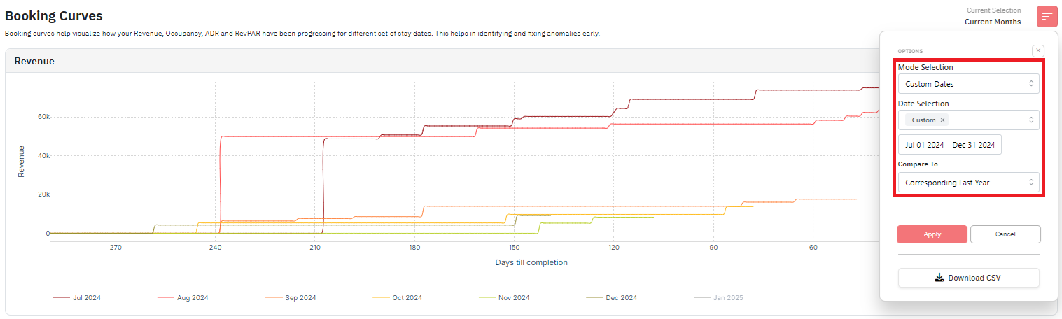
Booking Curves
Revenue
- By default, the graph shows the pacing curves for the Past 1 + Future 6 months.
- This graph shows how your listing’s performance has been evolving for the upcoming months in terms of Revenue, Occupancy, ADR and RevPAR.
- The x axis shows the days till completion for the selected months.
- The y axis shows the specific metric (Revenue, Occupancy, ADR or RevPAR).
- Instead of the current months, it’s also possible to choose custom dates to look at specific months compared to last month instead and also do a year-on-year comparison as seen below:
Revenue: Current Dates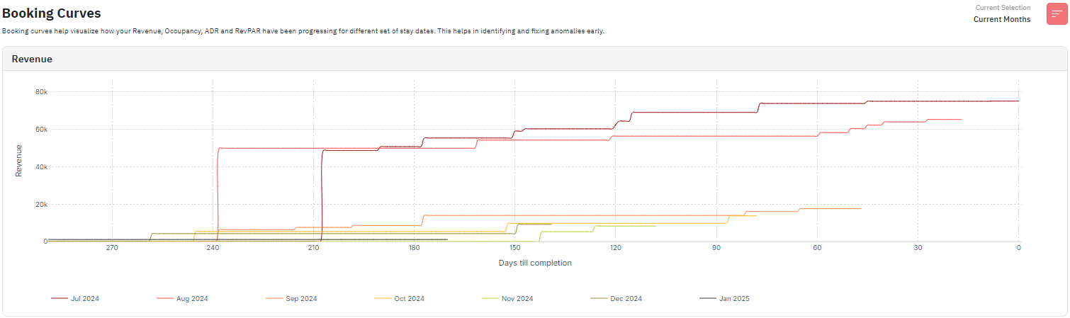
- This graph shows the listing’s revenue performance for the Past 1 + Future 6 months.
- The different colors as seen on the legends represent the different months and their revenue performance to date.
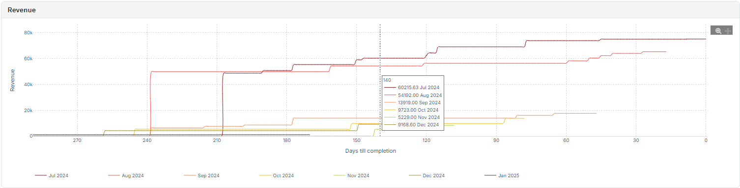
- If you place the cursor on any specific section on the graph, it will show the days till completion number for that date and also show the revenue made by the listings up until that date.
- Generally, the trend is that the revenue will increase as the days till completion reduce in number.
- If you look at more past months, you can also compare which months in the past made a higher revenue at completion.
- You can also spot if some specific months got bookings very early on due to some specific events/holidays. Ex: in the above image, the listings are in Paris and the month of Aug 2024 saw bookings very early on due to Olympics 2024.
Revenue: Custom Dates
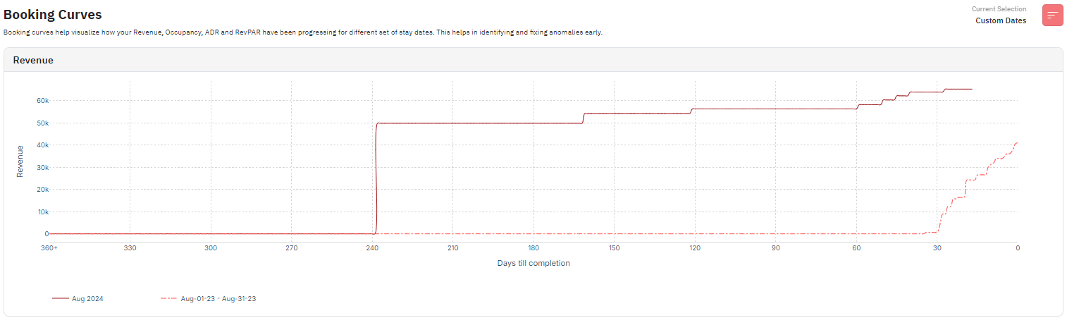
- This graph shows the listing’s revenue performance over the current month compared to the same month last year.
- The solid color line shows the current month's performance and the dotted color line shows the same month as last year’s performance.
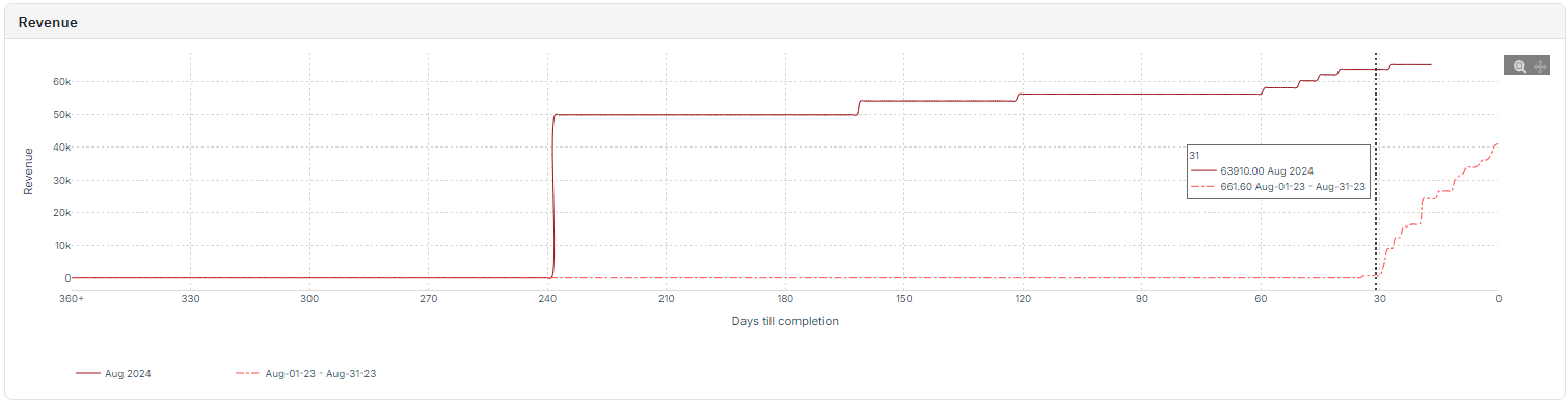
- If you place the cursor on any specific section on the graph, it will show the days till completion number for that date and also show the revenue made by the listings up until that date for the current month and the same month last year.
- This graph will show you if the listings are making more revenue this year compared to the last year.
- You can also spot if the current month got bookings very early on due to some specific events/holidays.
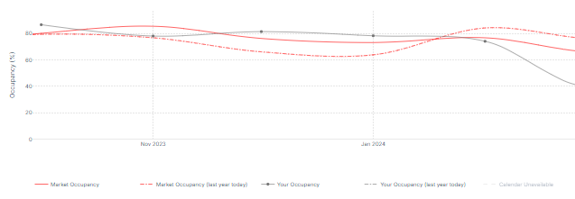
Occupancy
Occupancy: Current Dates
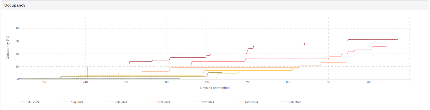
- This graph shows the listing’s occupancy performance for the Past 1 + Future 6 months
- The different colors as seen on the legends represent the different months and their occupancy performance to date.
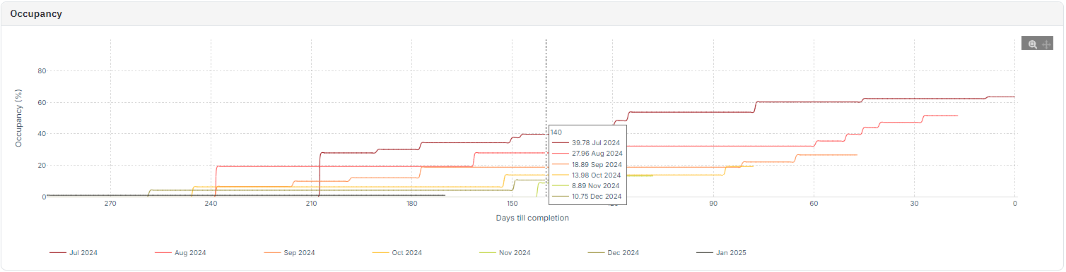
- If you place the cursor on any specific section on the graph, it will show the days till completion number for that date and also show the occupancy percentage of the listings up until that date.
- Generally, the trend is that the occupancy will increase as the days till completion reduce in number.
- If you look at more past months, you can also compare which months in the past had a higher occupancy percentage at completion.
- You can also spot if some specific months got occupied very early on due to some specific events/holidays.
Occupancy: Custom Dates
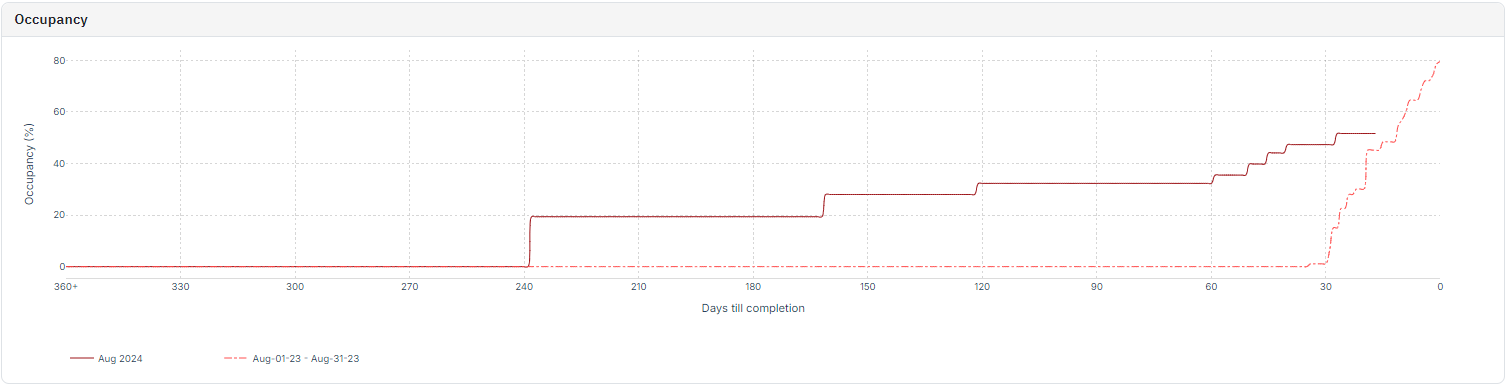
- This graph shows the listing’s occupancy performance over the current month compared to the same month last year.
- The solid color line shows the current month's performance and the dotted color line shows the same month as last year’s performance.
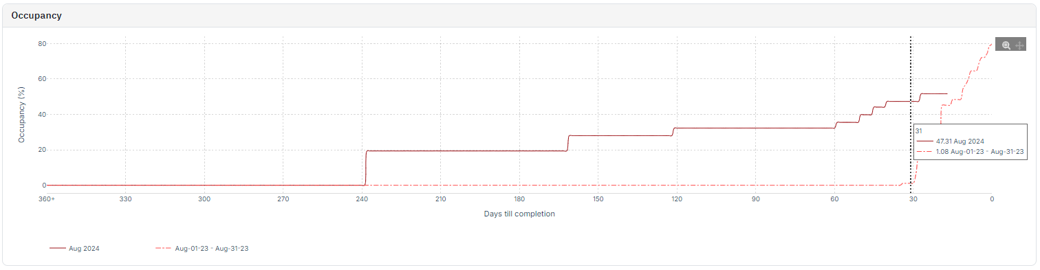
- If you place the cursor on any specific section on the graph, it will show the days till completion number for that date and also show the occupancy of the listings up until that date for the current month and the same month last year.
- This graph will show you if the listings are more occupied this year compared to last year.
- You can also spot if the current month got bookings very early on due to some specific events/holidays.
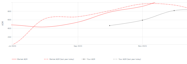
ADR
ADR: Current Dates
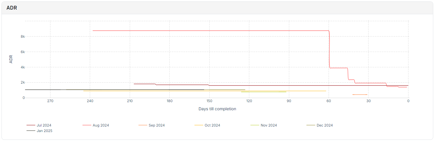
- This graph shows the listing’s ADR performance for the Past 1 + Future 6 months
- The different colors as seen on the legends represent the different months and their ADR performance to date.
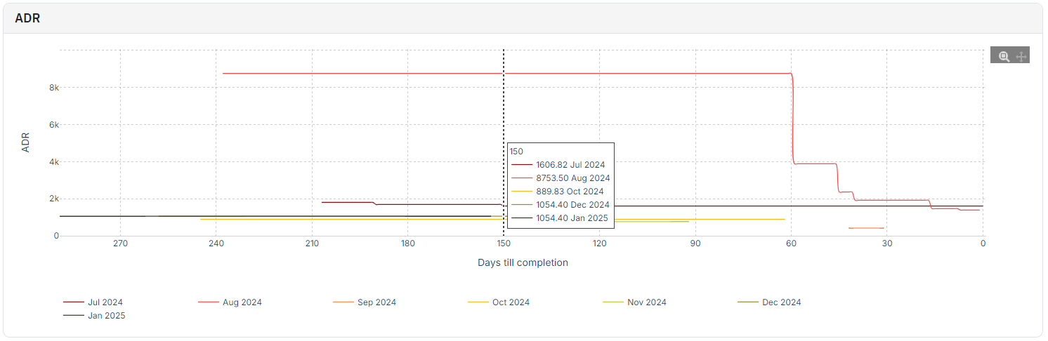
- If you place the cursor on any specific section on the graph, it will show the days till completion number for that date and also show the ADR performance of the listings up until that date.
- Generally, the trend is that the ADR will decrease as the days till completion reduce in number. This is because the nightly prices for the listing drops as the dates get closer.
- If you look at more past months, you can also compare how the previous months performed ADR wise and if there were any outliers.
- Users can also spot if some specific months got bookings very early on at high ADRs due to some specific events/holidays. Ex: in the above image, the listings are in Paris and the month of Aug 2024 saw bookings very early on due to Olympics 2024 at significantly higher ADRs.
- You can also spot if any months are underperforming ADR wise which could show if the user is underselling their listing to gain occupancy and tradeoff revenue/RevPAR.
ADR: Custom Dates
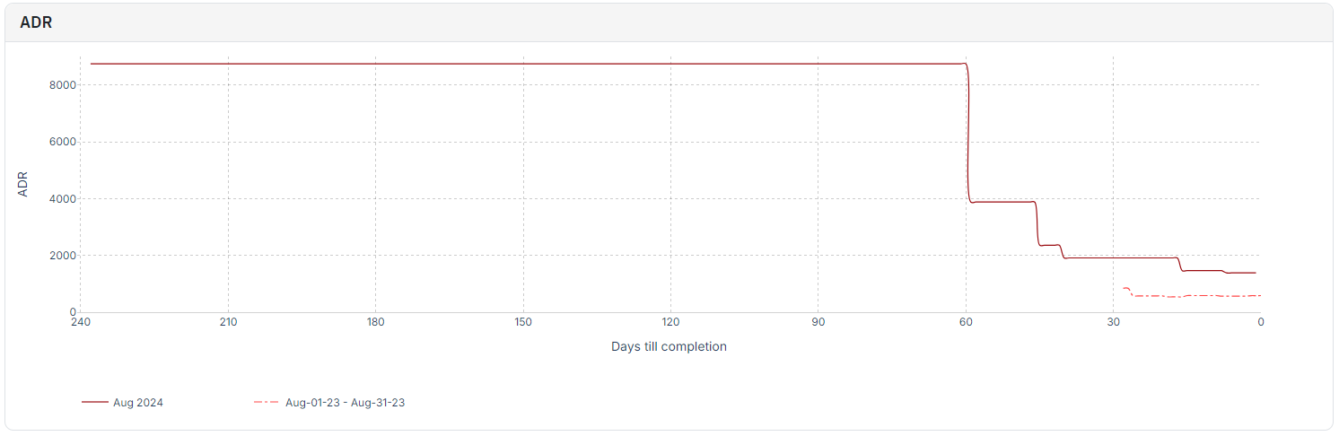
- This graph shows the listing’s ADR performance over the current month compared to the same month last year.
- The solid color line shows the current month's performance and the dotted color line shows the same month as last year’s performance.

- If you place the cursor on any specific section on the graph, it will show the days till completion number for that date and also show the ADR performance of the listings up until that date for the current month and the same month last year.
- This graph will show you if the listings are making more/less ADR this year compared to the last year. Basis which users can compare other graphs and reconsider pricing/min stay strategy.
- You can also spot if the current month got bookings very early on at higher ADR due to some specific events/holidays. Here, the user saw bookings for Aug 2024 at significantly higher prices and very early on.
RevPar
RevPAR: Current Dates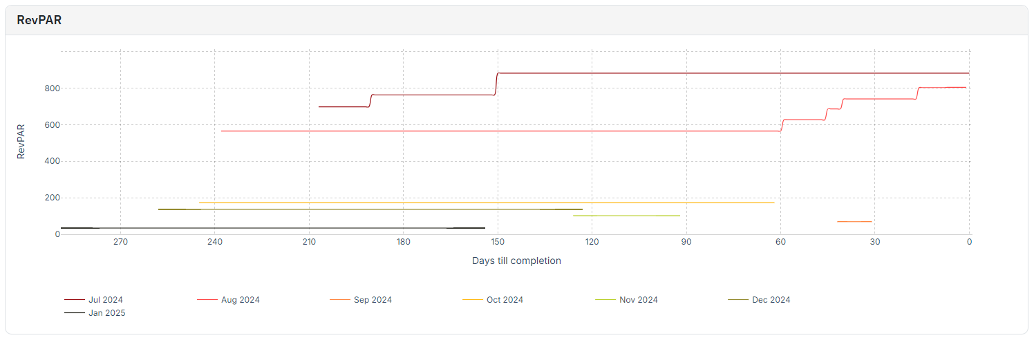
- You can also spot if the current month got bookings very early on at higher ADR due to some specific events/holidays. Here, the user saw bookings for Aug 2024 at significantly higher prices and very early on.
- This graph shows the listing’s RevPAR performance for the Past 1 + Future 6 months
- The different colors as seen on the legends represent the different months and their RevPAR performance to date.
- If you place the cursor on any specific section on the graph, it will show the days till completion number for that date and also show the RevPAR performance of the listings up until that date.
- Generally, the trend is that the RevPAR will usually increase as the days till completion reduce in number. This is because RevPAR = ADR x Occupancy. So, even though ADR drops as dates get closer, occupancy should likely increase and result in an overall upward trend for RevPAR.
- If you look at more past months, you can also compare how the previous months performed RevPAR wise and if there were any outliers.
- Users can also spot if some specific months got bookings very early on at high RevPARs due to some specific events/holidays. Ex: in the above image, the listings are in Paris and the month of Aug 2024 saw good occupancy numbers very early on due to Olympics 2024 at significantly higher ADRs, resulting in a good RevPAR performance for Aug 2024.
- You can also spot if any months are underperforming RevPAR wise which could show if any listings are yet to hit their booking window or if their ADR is too high.
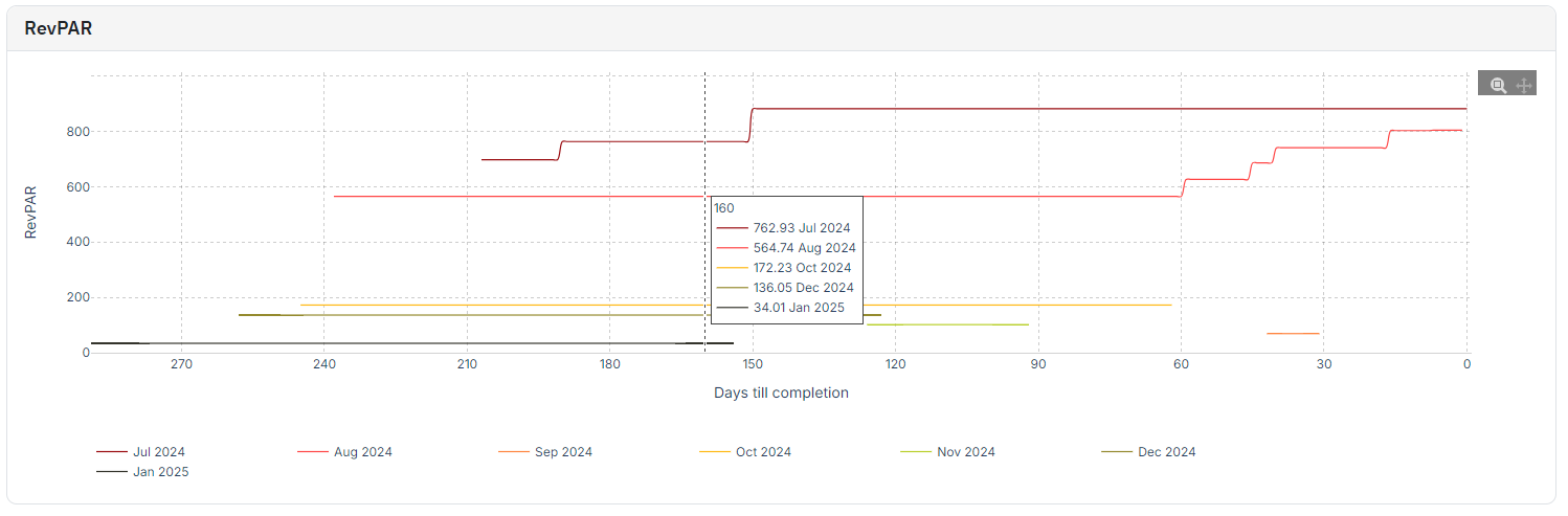
RevPAR: Custom Dates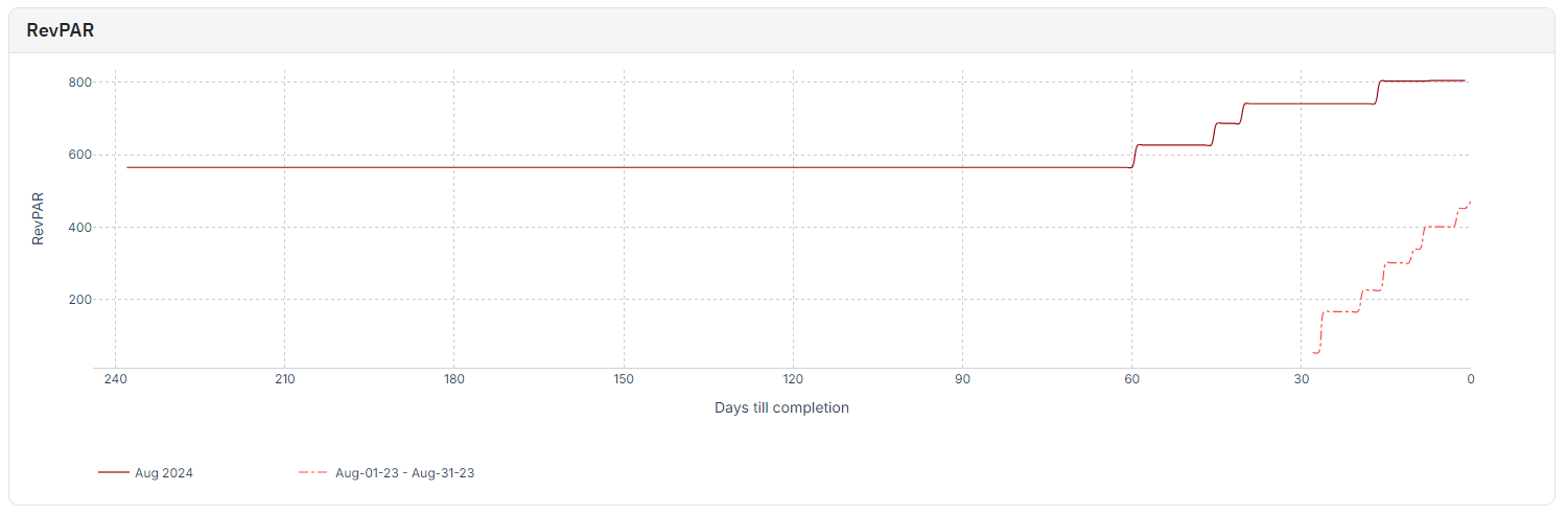
- You can also spot if any months are underperforming RevPAR wise which could show if any listings are yet to hit their booking window or if their ADR is too high.
- This graph shows the listing’s RevPAR performance over the current month compared to the same month last year.
- The solid color line shows the current month's performance and the dotted color line shows the same month as last year’s performance.

- If you place the cursor on any specific section on the graph, it will show the days till completion number for that date and also show the RevPAR performance of the listings up until that date for the current month and the same month last year.
- This graph will show you if the listings are making more/less RevPAR this year compared to the last year. Basis which users can compare other graphs and reconsider pricing/min stay strategy.
- You can also spot if the current month got bookings very early on at higher RevPAR due to some specific events/holidays. Here, the user saw bookings for Aug 2024 at significantly higher prices and very early on resulting in a good start for the RevPAR.
Related Articles
Portfolio Analytics: Pacing Reports
This report is more future-focused to bring out actionable information to drive changes in revenue management strategies and is good to be reviewed periodically. The Pacing chart in Portfolio Analytics gives insights into your booking rate against a ...Decoding Portfolio Analytics: How KPI & Historic Report Drive Smarter Decisions (A Compilation of Case Uses)
Understanding how to navigate and reach the graphs in Portfolio Analytics is important. However, knowing about how you can use this information to better set up your listings is equally important. So, let us go over some of the case uses for ...Portfolio Analytics: KPIs & Historic Reports
This report is more backward-focused and is not necessarily needed for daily decision-making. KPIs The first section of the report displays Key Performance Indicators (KPIs), allowing you to compare broad metrics across various dates to observe ...What is Portfolio Analytics and how to use it?
Portfolio Analytics is one of PriceLabs’ key features, providing insights into the performance of your vacation rental portfolio. It displays metrics like occupancy rate, average daily rate (ADR), and revenue per available room (RevPAR) through ...Getting Started with Report Builder
PriceLabs Report Builder is a free tool designed to enhance your reporting and data analysis capabilities within PriceLabs. With report builder, you can create, customize, and save reports that are tailored to your business and your regular ...
Sign up for training
To help you get the most out of PriceLabs, we have training webinars in English, Spanish, Portuguese and French. Click here to Register.