Decoding Portfolio Analytics: How KPI & Historic Report Drive Smarter Decisions (A Compilation of Case Uses)
Understanding how to navigate and reach the graphs in Portfolio Analytics is important. However, knowing about how you can use this information to better set up your listings is equally important. So, let us go over some of the case uses for Portfolio Analytics to help you better understand each chart and its practical applications.
Trends By Stay Date
Revenue
Understanding the historical revenue per month for a listing or portfolio offers crucial insights into its financial performance over time. By analyzing this data, we can pinpoint consistently high revenue months and adjust pricing strategies accordingly to maximize profitability. Conversely, they can devise alternative strategies for months with lower revenue, such as offering discounts or promotions to stimulate demand.
Use cases:
- Can be used as a reference to estimate the subscription costs should they consider moving to percentage billing.
- Allows us to compare whether PriceLabs has been effective if revenue has increased since joining.
RevPAR
RevPAR (Revenue Per Available Room) can effectively predict your ADR’s success at filling available rooms. This, therefore, provides a constructive view of your property’s operational performance. It is the balance between the occupancy rate and ADR that is, it is the occupancy rate multiplied by the average daily rate.
RevPAR allows you to account both for the occupancy rate and ADR simultaneously. This is much more powerful than looking at those metrics alone. You could have a high ADR and low occupancy. Or a low ADR and high occupancy. Both of these signify poor performance. When your RevPAR is trending up, you’ll realize your performance is improving.
More about this here: Top 6 Vacation Rental KPIs You Should Measure.
Occupancy
The graph provided shows the Occupancy Rate in % over time from January to December across multiple years indicated.
Use Cases:
- You can see which is your high and low season if there’s a recurring pattern of occupancy rates across past years
- You can conduct a comparative analysis between years to highlight which month had higher or lower occupancy rates.
It will give you an idea of your occupancy rate forecast. You can use this graph to look back on years with similar or different patterns(was there a significant event for that month that boosted or lowered the occupancy rate) so you can plan and predict your future occupancy rate.
ADR
The graph provided shows the ADR or Average Daily Rate in USD over time from January to December across multiple years indicated.
Use Cases:
- You can look for a seasonal pattern to see which month will be your highest/lowest ADR.
- You can compare past years and see what daily rate you should expect for a specific month, which can give you an idea for your future pricing strategies based on historical trends.
No. of Active Listing
The provided graph shows the number of active listings across the entire account or within selected listings for Portfolio Analytics.
While the number of active listings may not provide as much insight on its own compared to other graphs, it becomes more valuable when paired with other data.
Use cases:
- You can check this graph to see if it affects market occupancy. If market occupancy drops, then we can see the supply and demand. This indicates bookings in the market did not increase; however, listings increased, dropping market occupancy.
- To understand how saturated the market is at the moment with active listings and based on that planning the pricing of your listing and promotions.
No. of Check-ins and Check-outs
Like the previous one, these graphs must be selected from the drop-down menu. They illustrate the number of unique Check-ins/outs with the selected frequency. They can be used to estimate the workload related to preparation and cleaning after the stays are over, especially for bigger portfolios.
Here, when filtering by day of the week, you can understand which days are the most popular for Check-in or -out.
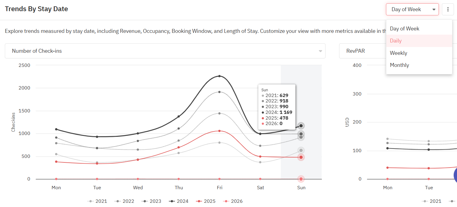
You likely don't want to see your guests checking out in the middle of the weekend, as it's not optimal for your revenue.
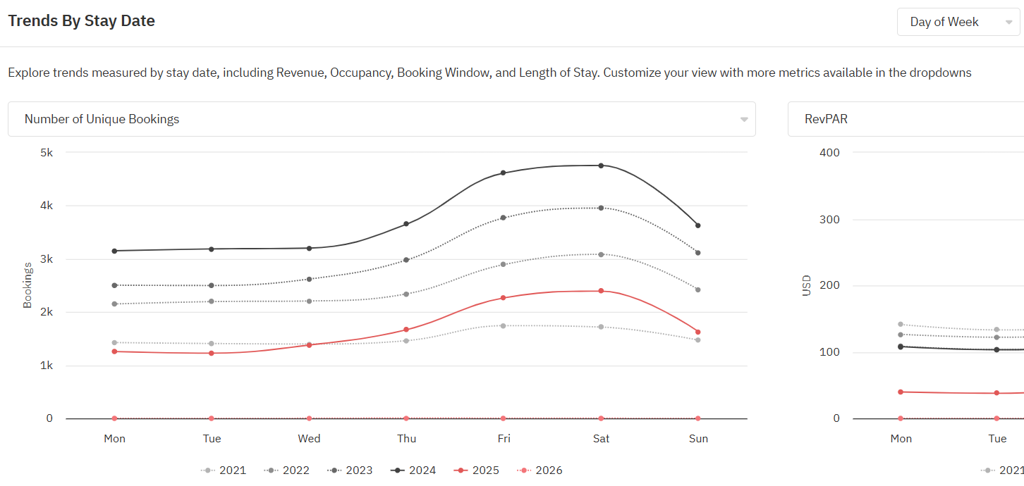
No. of Unique Bookings
This graph is not shown by default and can be selected from a drop-down menu in the Trends by Stay Day section. It shows the number of unique stays with selected frequency(monthly, weekly, daily, or by day of the week).
However, it does not illustrate the length of said stays, so it can be tricky to use it to estimate performance(especially in the case of longer stays or the mid-term market).
When viewing the data by Day of the Week, you can easily understand which days are the busiest for a specific listing, a selected group, or the entire portfolio. The below graph illustrates how Friday and Saturday are the most booked days of the week:
Trends By Booking Creation Dates
Revenue
This chart gives us an idea about the estimated revenue the listings selected received from the bookings which were created within the specific month. The booking date can be any date in future.
Use Cases:
- To analyze and compare the business's revenue performance over different years.
- To project future revenues by examining which month gets more bookings.
- To evaluate the effectiveness of marketing campaigns run during a specific period by looking at bookings created during that time.
- To understand the impact of seasonality on revenue by comparing how different periods perform across various years.
- To allocate budgets and resources effectively by understanding revenue inflows during specific periods.
No. of Unique Bookings
This chart gives us an idea about the number of bookings the listings selected received within the specific month. Using this graph, we can observe and compare the demand for the particular listings for a specific period between various years.
Use Cases:
- Identify peak and off-peak months.
- Time campaigns based on booking trends.
- Compare monthly booking growth across years.
- Adjust prices based on monthly demand.
- Spot unusual booking patterns.
- Understand booking preferences by month.
- Project revenue based on historical bookings.
- Visualize business performance trends.
ADR
This metric helps us to visualize the Average Daily Rate trend for the bookings received within the specific month.
Use Cases:
- Track and optimize ADR to maximize revenue.
- Adjust rates based on historical ADR trends by month.
- Identify seasonal pricing patterns and peak rate periods.
- Analyze ADR changes to measure growth or decline.
- Inform financial planning and revenue projections.
- Assess the effect of promotions or discounts on ADR.
- Align costs and services with expected ADR.
Average Length of Stay
This metric helps us to visualize the Average length of stay for the bookings received in various months mentioned above.
This chart can be used to understand the average length of stay of your listing/portfolio. You can view this for a specific month after hovering over it, and it will give you data on the average Length of stay for past years as well (based on data we have for your listings).
Use Case:
- You can then compare the average Length of stay with the Occupancy and Revenue to understand which Length of stay impacted the performance of your listing/ portfolio.
- Compare which Length of stay gives you maximum occupancy to previous years and then set your minimum stays accordingly.
Average Booking Window
This metric gives us an idea about the average booking window (number of nights between when the booking was created and the check in date) of the bookings received/created within the specific month per year.
Use Cases:
- Understand how far in advance customers book during different months.
- Tailor promotions to target early or last-minute bookers.
- Adjust pricing based on typical booking lead times.
- Optimize availability by anticipating booking windows.
- Identify seasonal trends in booking lead times.
- Predict future booking behavior based on historical trends.
- Identify different customer types (e.g., planners vs. last-minute bookers).
Length of Stay and Booking Window Trends
By default, the chart shows trends for bookings created over the past 30 days. You can choose a desired date range to view data for 4 possible combinations:
Booking Creation Dates vs Total Booked Nights
Graph 1 here shows that of all the bookings created in the last 30 days(in this case) and how days between the booking and the stay dates.
Graph 2 here shows that of all the bookings created in the last 30 days and how many days they are staying.
Booking Creation Dates vs Booked Nights by Booking Window and LOS
This view shows a further breakdown of the bookings created in the past 30 days(in this case).
Graph 1 shows the number of booked nights based on how far in advance (Booking Window) reservations were made, segmented by Length of Stay (LOS).
Graph 2 displays the number of booked nights based on the length of stay, segmented by how far in advance the booking was made.
Stay Dates vs Total Booked Nights
Graph 1 shows the total booked nights based on the booking window.
Graph 2 presents the total booked nights based on the length of stay.
Stay Dates vs Booked Nights by Booking Window and LOS
Graph 1 shows the number of Stay Dates based on how far in advance (Booking Window) reservations were made, segmented by Length of Stay (LOS).
Graph 2 displays the number of Stay Dates based on the length of stay, segmented by how far in advance the booking was made.
Viewing the trends for past dates shows the full picture whereas viewing the trends for upcoming dates will lack the data for bookings that will likely happen between present date to future date.
Related Articles
Portfolio Analytics: KPIs & Historic Reports
This report is more backward-focused and is not necessarily needed for daily decision-making. KPIs The first section of the report displays Key Performance Indicators (KPIs), allowing you to compare broad metrics across various dates to observe ...Mastering Portfolio Analytics: Using Pacing Reports to Track and Adapt (A Compilation of Case Uses)
Understanding key performance metrics is crucial for optimizing revenue management strategies when managing a portfolio of rental properties or hotels. Four essential metrics in this context are Listed Price, Occupancy, Average Daily Rate (ADR), and ...Portfolio Analytics: Pacing Reports
This report is more future-focused to bring out actionable information to drive changes in revenue management strategies and is good to be reviewed periodically. The Pacing chart in Portfolio Analytics gives insights into your booking rate against a ...What is Portfolio Analytics and how to use it?
Portfolio Analytics is one of PriceLabs’ key features, providing insights into the performance of your vacation rental portfolio. It displays metrics like occupancy rate, average daily rate (ADR), and revenue per available room (RevPAR) through ...Portfolio Analytics: Spot Actionable Trends In Your Bookings
What is Portfolio Analytics and how to use it? One of the key features of PriceLabs is Portfolio Analytics, which provides you with valuable insights into the performance of your vacation rental portfolio. Portfolio Analytics is a dashboard that ...
Sign up for training
To help you get the most out of PriceLabs, we have training webinars in English, Spanish, Portuguese and French. Click here to Register.